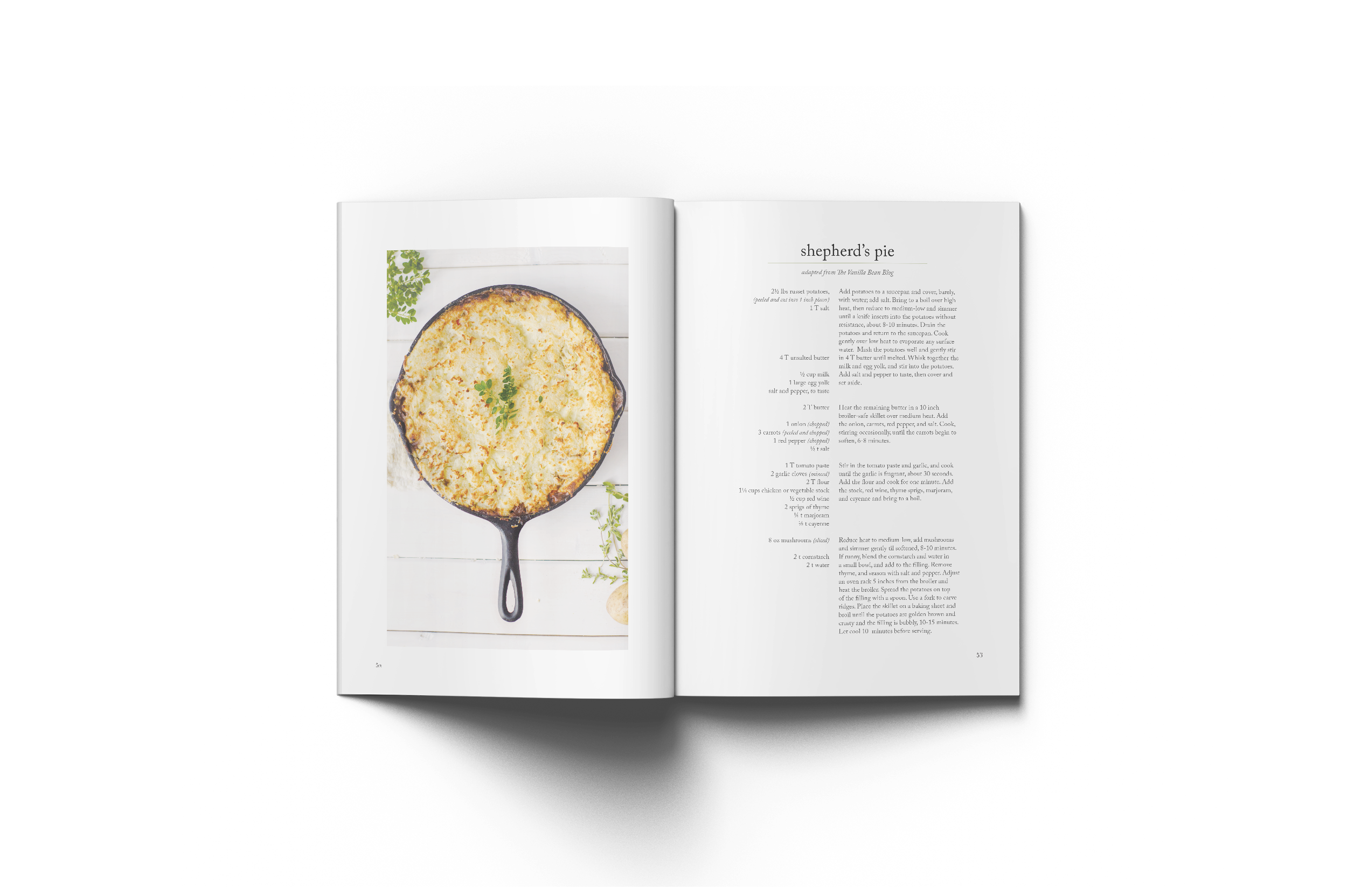
I photographed & designed a cookbook in 2013.
Although I made this for my senior thesis, I still stand behind the majority of the work. I see my love for unfussy layouts, serif typography, and compelling photography already taking shape. If I could do it again, I’d scrap the tracked out lowercase type, incorporate more rhythm and variety in the layouts of each section, and hire a prop stylist.


My talented friend Rachel Bridgewood photographed my hands in action for each section opener. Hands became a major theme for me in the book—I find something irreplaceable about hand-prepared food.


My great innovation in this design was relegating ingredients to one column, and vertically aligning them to the step in which they were used. This allows you to both scan the ingredients to make a shopping list and to easily reference the ingredient amount as you cook.
