I shape data to tell clear and compelling stories
For the years before The Atlantic had an in-house data visualization team, I was the main data expert. I art directed most of the maps, charts, and graphs that appeared in the print magazine and, eventually, began making my own.
July/August 2020
I created graphics of four economic scenarios, showing how investments that are current rated extremely secure (AAA) could sustain extensive defaults and portend widespread economic disaster. The result is an intuitive, digestible visualization of Frank Partnoy’s argument: our economy is not as secure as we think.
May 2021
I worked painstakingly to overlay pre-European tribal boundaries, current national parks and current reservations on a map of the United States. I spearheaded this effort and personally researched the many data sets needed to yield this visualization. The result helps the reader understand amount of land tribes currently govern and see the amount of land David Truer suggests the United States return to the tribes.
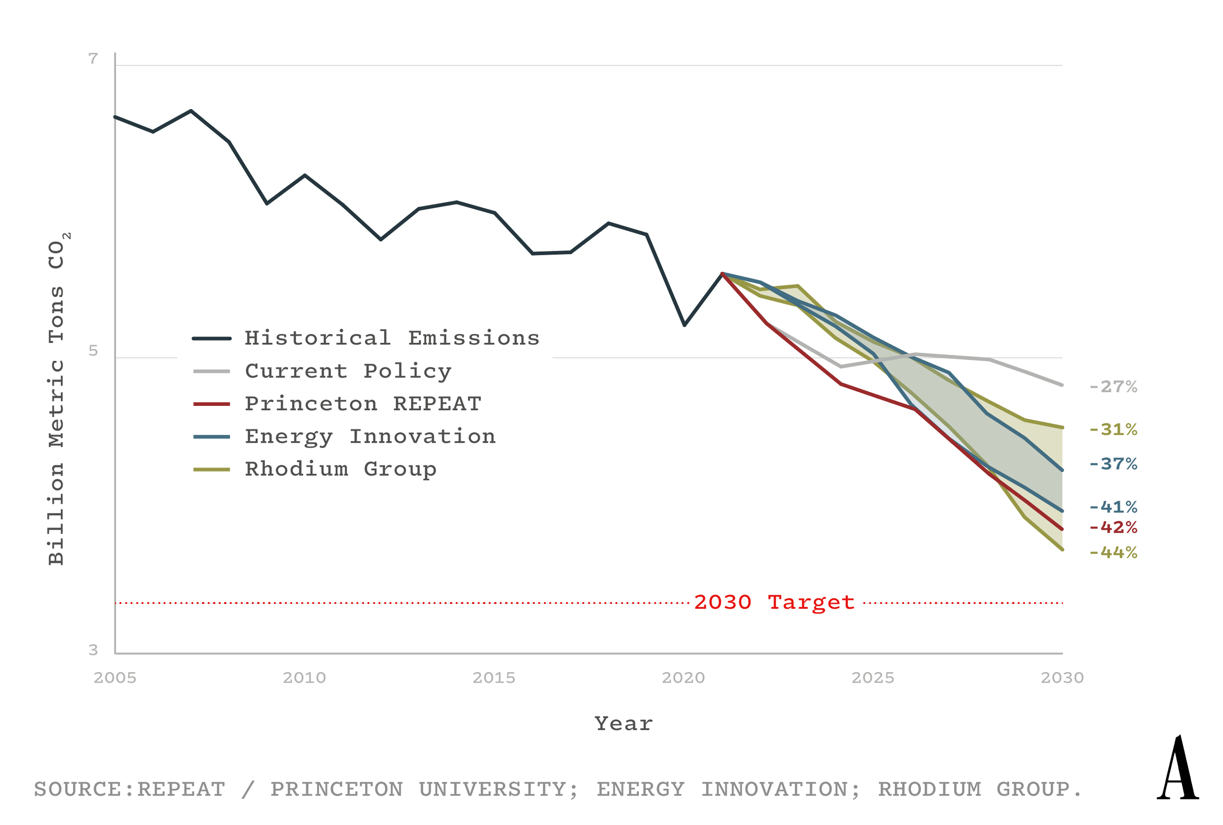
In 2022, I worked with Aithne Fay to set company-wide design standards for charts, graphs, and maps. We partnered with Datawrapper to create a user-friendly template that consistently implemented our typography, color ways, and logo placement. Below are a variety of visualizations published using that tool.
October 2021
I created this map of the greater Portland area to illustrate an incredible story of local Oregonians who banded together to keep two wildfires from merging—and likely engulfing the metropolitan area. I highlight significant locations mentioned throughout the story and overlay the boundaries of each wildfire on the day they almost combined.


