A visual social media strategy
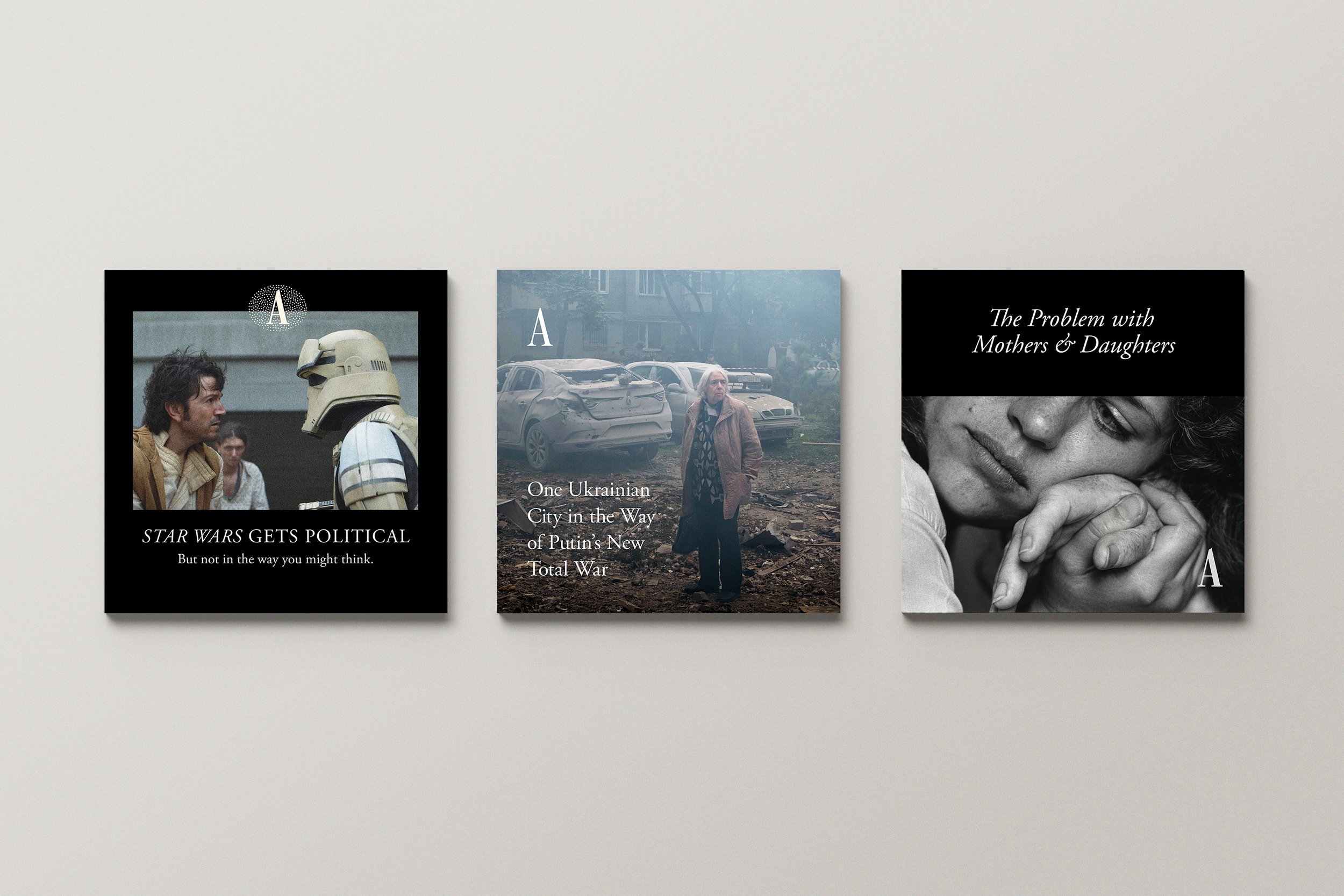
In the fall of 2022, I reimagined The Atlantic’s Instagram templates. I poured over our magazine templates and developed a handful of type styles that captured the understated confidence and simple elegance The Atlantic is known for. The resulting system is flexible enough to showcase each image’s unique strengths and consistent enough to preserve brand recognition.
Two years later, I’m pleased to see most of these templates still in regular use on The Atlantic's Instagram.


During my tenure, overall views and engagement increased, even during overall traffic slumps. I’m most proud of the way good design helped revitalize audience interest in topics that used to flop.


Designing for non-designers
In 2024 I designed Instagram templates for a local church who wanted to post several times a week but couldn’t afford to keep a designer on retainer.
I took their original branding—bold, urban—and incorporated some softer, more traditional elements that better captured the vibe of the current congregation. Since they had very little original artwork to showcase, my system relied heavily on typography, color, and grid activation. I built out 20+ templates in Figma and handed it off!
Thanks to the strength of the templates and the good design instincts of the content developer, Andrew Dalrymple, their page looks fantastic.


I find social design strategy exciting and satisfying. If you have work at the intersection of brand identity and social media presence, please reach out! I’d love to work with you.
