
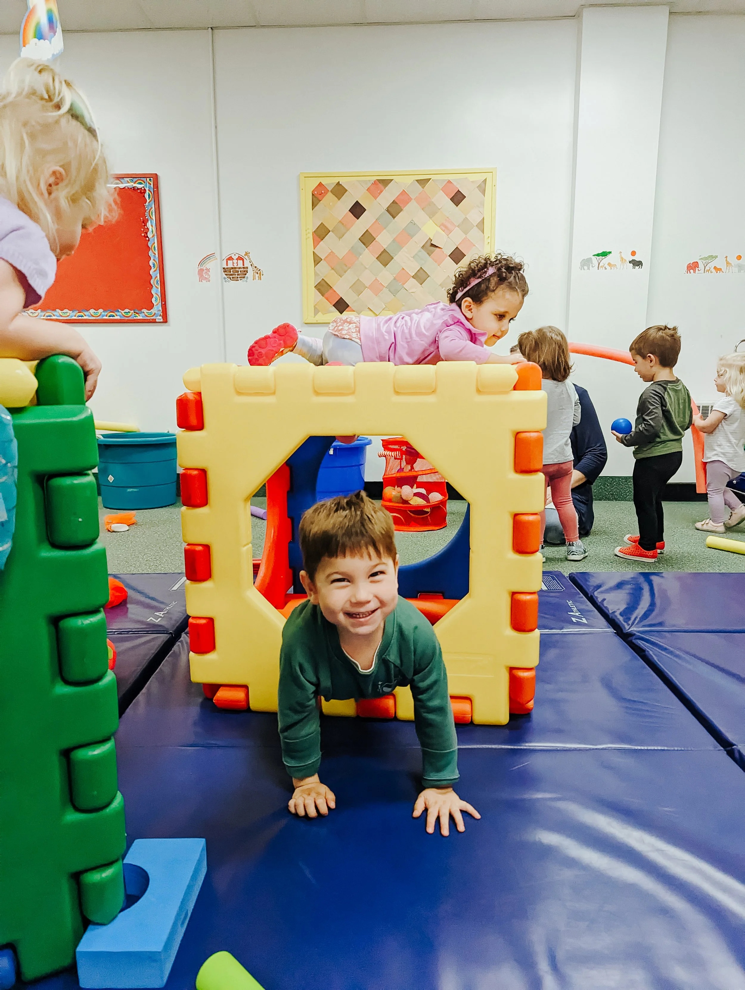
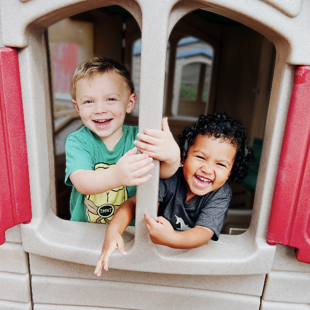
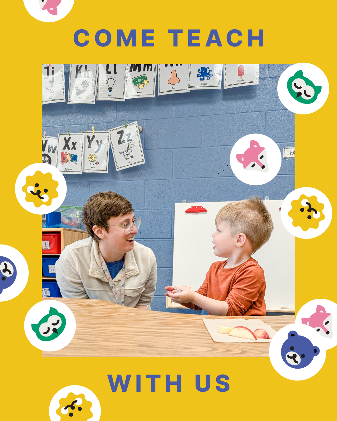
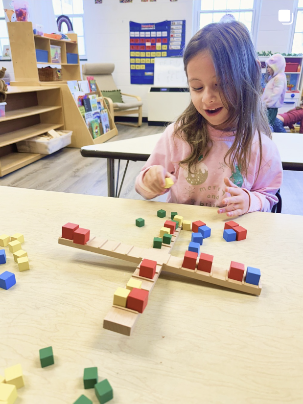
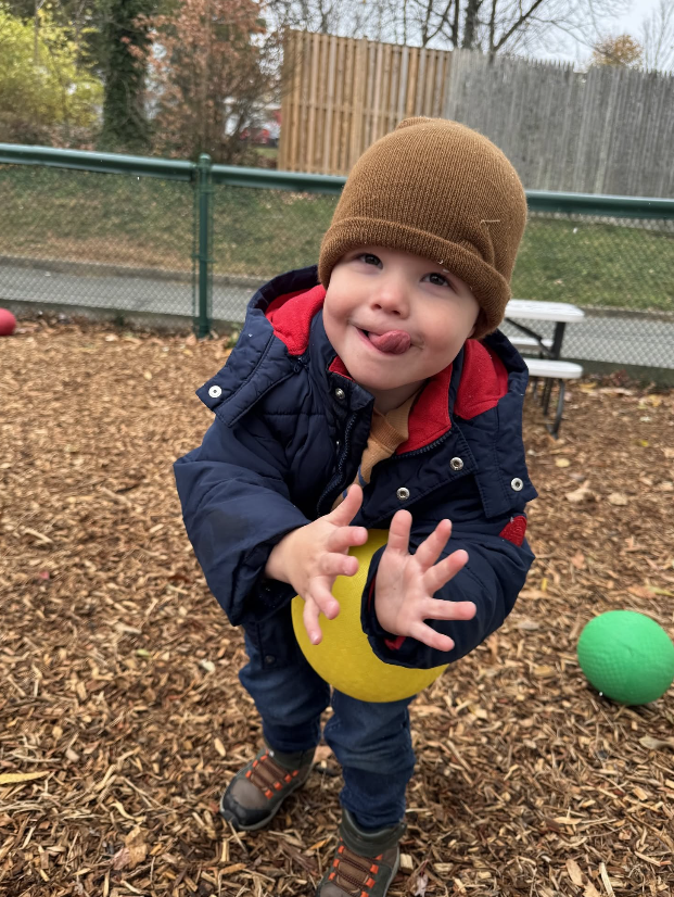
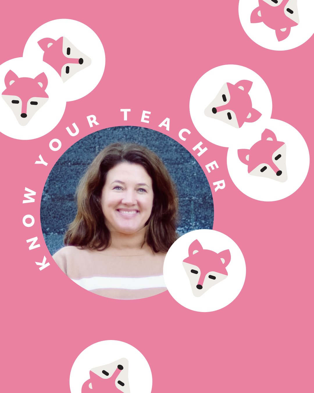
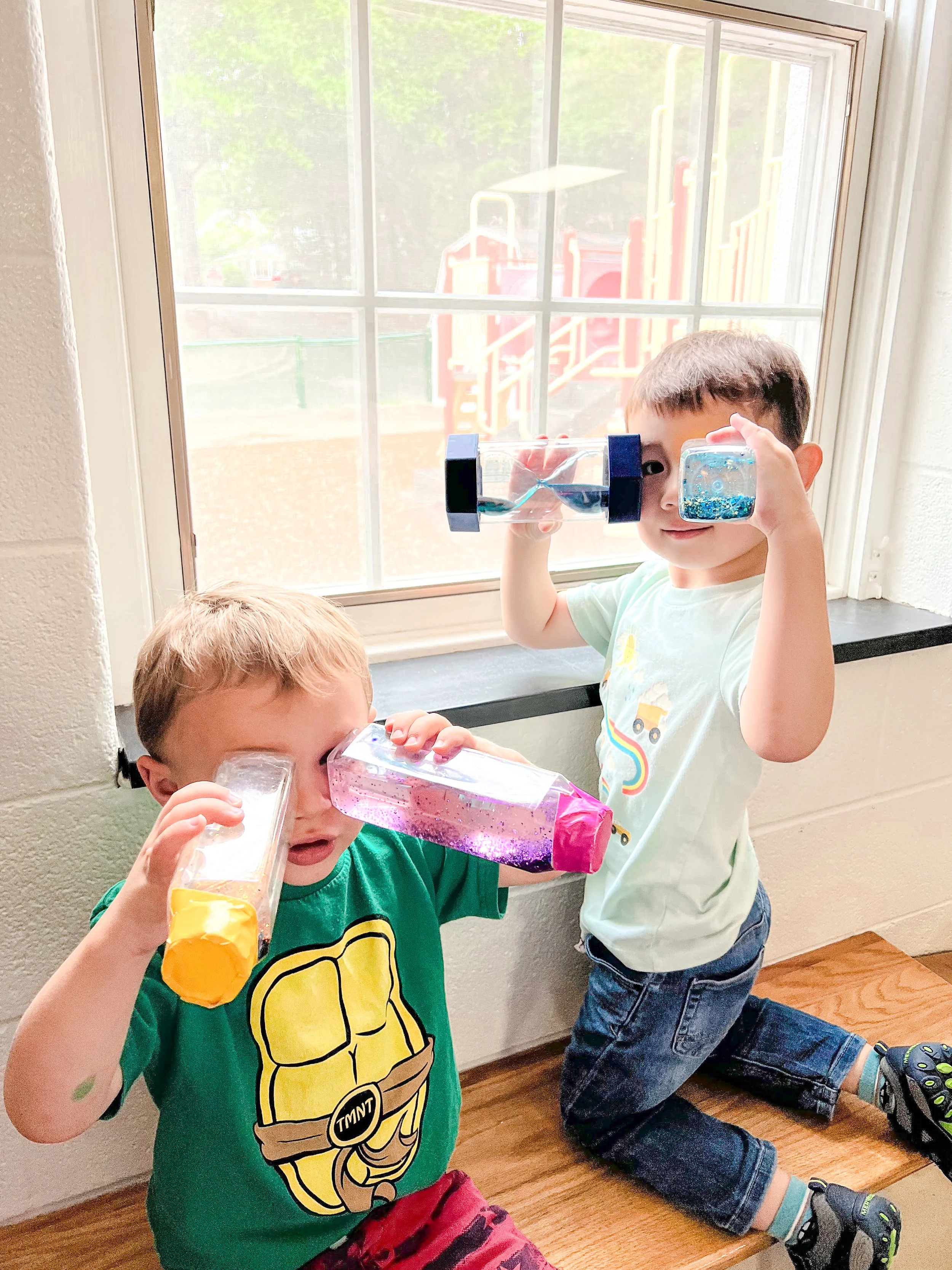
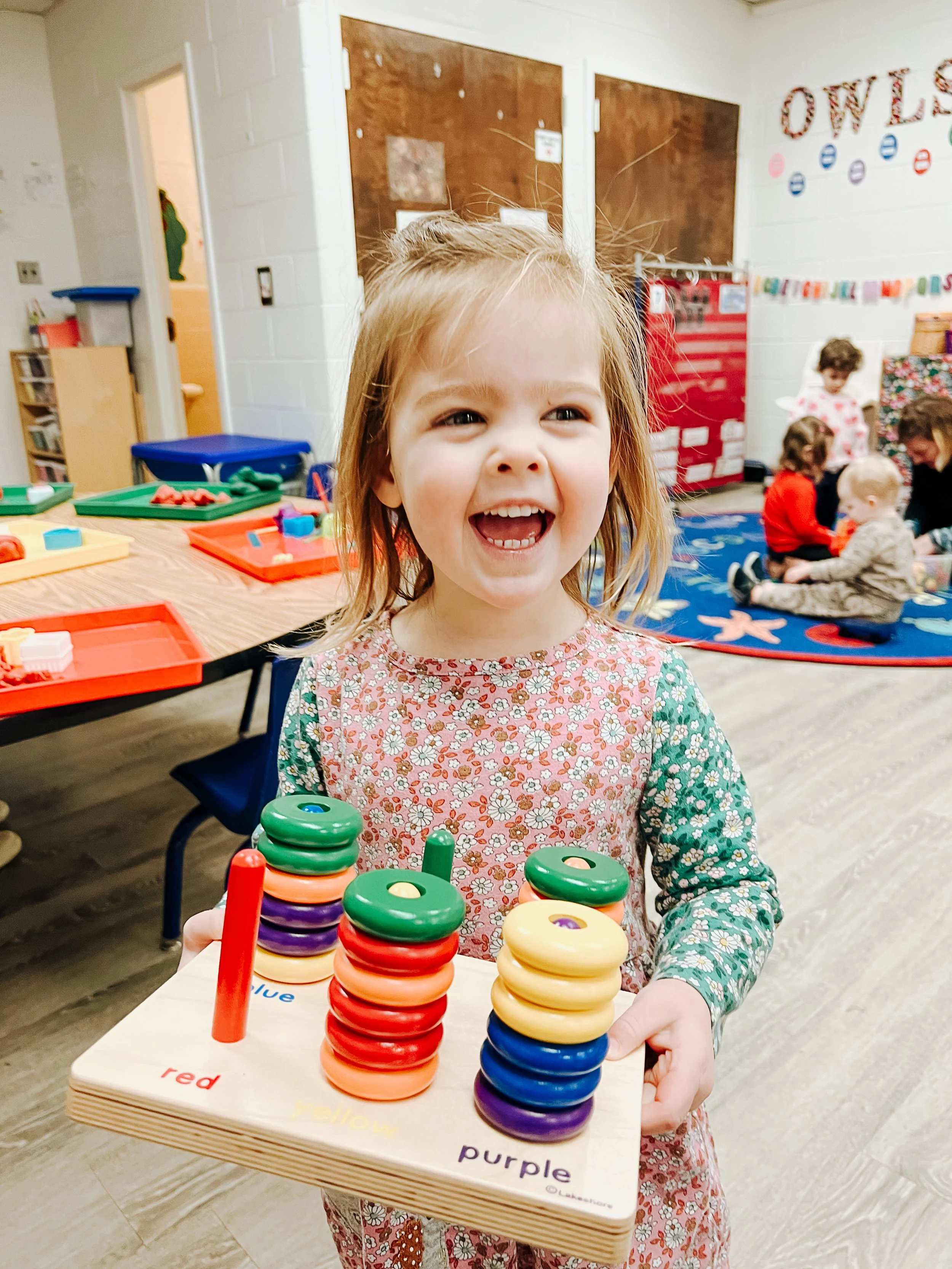
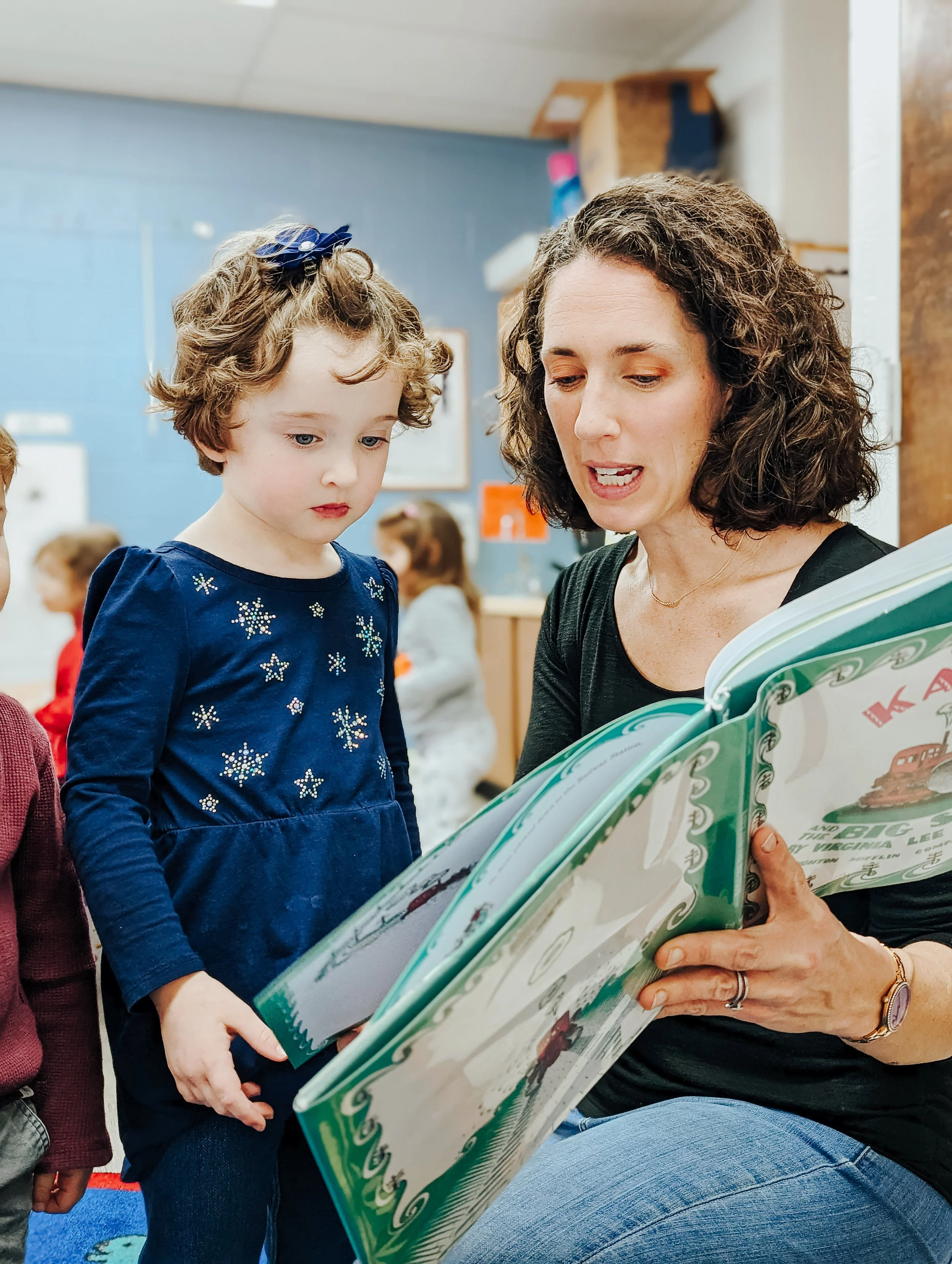
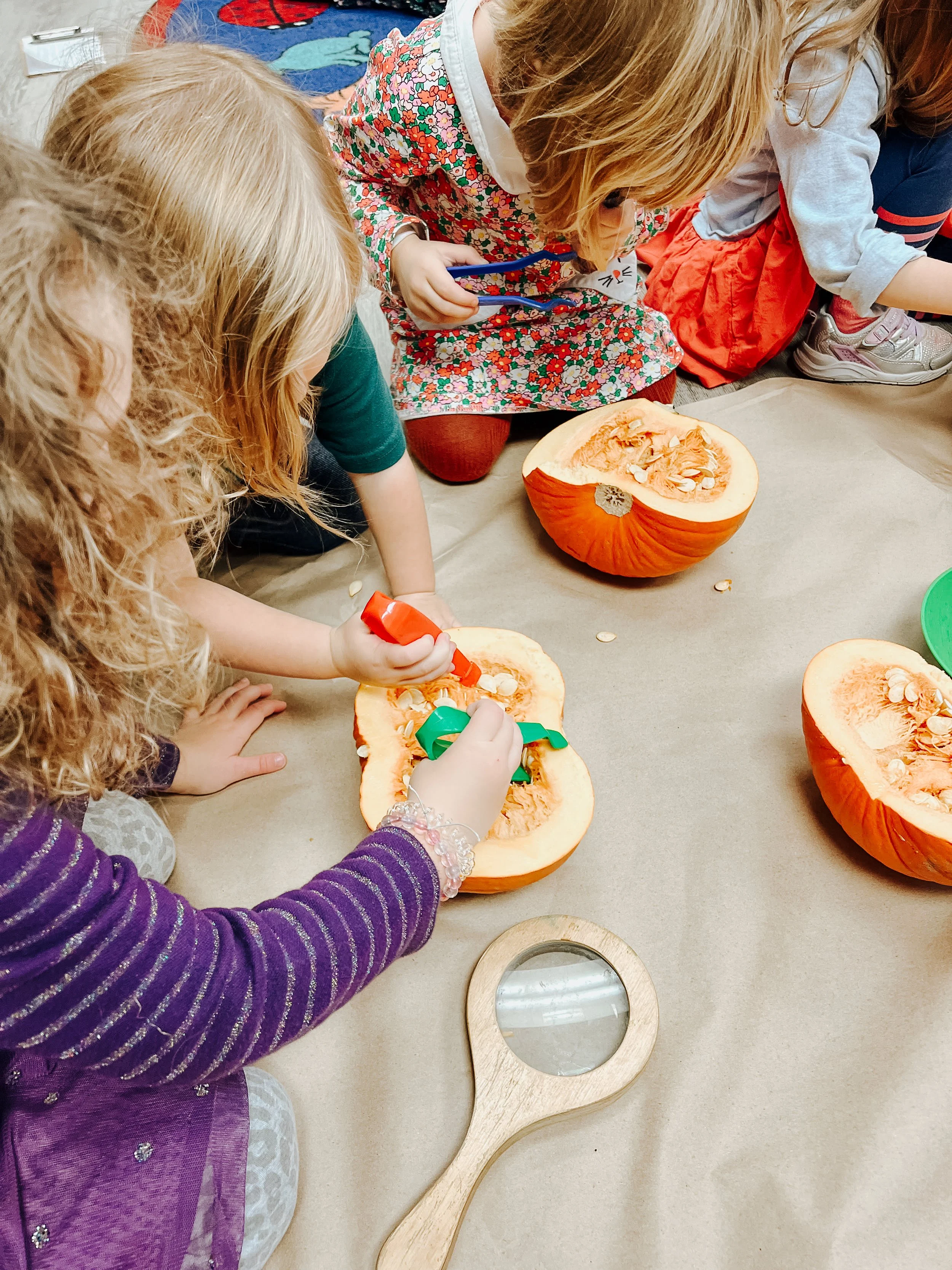
I worked with a local preschool that’s operated since the 1970s to modernize their logo, redesign their website, create a brand, and run their Instagram page for one school year. I loved designing for joy and play! It was such fun to work with bright colors, silly shapes, and photos of adorable children.


BEFORE
DURING
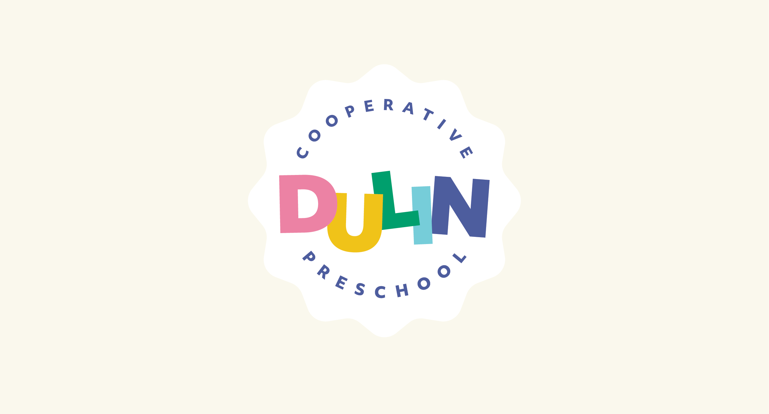
Dulin’s logo has evolved a lot over fifty years. From block letters surrounded by creepy children, to various designs involving animals, the logo almost always included an off-kilter element to the typography.

Their previous logo had several drawbacks: it didn’t scale well for social media; the “cooperative preschool” typeface was difficult to read; and the colors were so low contrast that they could not be used in other branding materials.
I started by refining the colors. I knew I wanted to maintain continuity with the past so that parents who grew up attending the school would still feel a kinship to it. I choose to keep the same color order, but shift to slightly cooler, more vibrant tones. The enhanced contrast enabled me to overlap the letters and keep the playful rotation of the letters without incorporating illustration.

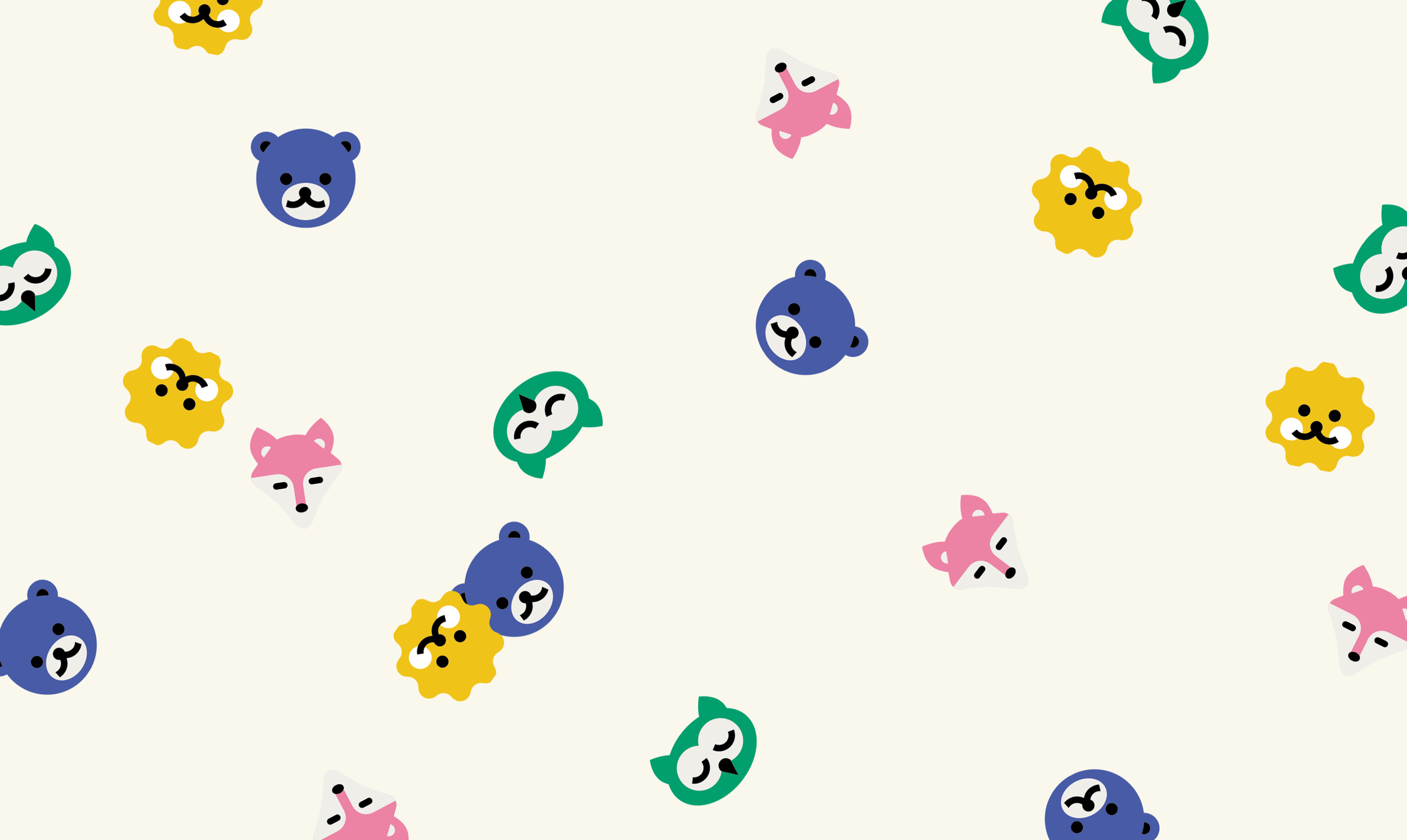
Next I tackled the animals! I spent a lot of time hunting for inspiration on Pinterest and found myself drawn to very simple vector illustrations. It took a lot of trial and error, but I’m incredibly pleased with my little animal buddies.

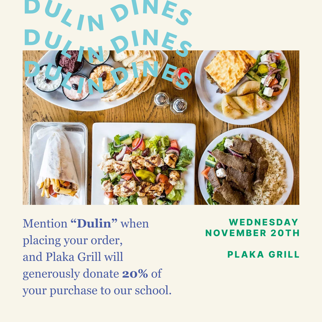
I loved the wiggly shape of the lion most of all, and that inspired the outline around the full logo mark. In fact, I loved the squiggle so much that I developed a pattern incorporating it and started using it as a design element in flyers and merch.

Once the basic brand elements were set, it was time to tackle all the things! Website, flyers, tablecloths, stickers, tshirts, signage, social templates and more!